Have you ever gone into a restaurant and contemplated the menu design and the effect it has on your overall dining experience? I would bet most haven’t; if you are anything like me, you are too busy ascertaining what you would like to eat rather than looking to see how the menu is arranged. But a lot of thought goes in to creating a menu that best portrays your restaurant, a menu that speaks to the quality of the food, service, and ambience provided to each guest during their meal. From organization to language, to color scheme to pricing, read on for some suggestions for creating your next menu.
The best organization of your menu has as much to do with psychology as with the order in which your customers will eat. Some research suggest that the consumers’ eyes go directly to the upper right corner of the menu, other research states that diners will typically read the menu as they do a book—left to right, top to bottom. Utilize this research to give your best dishes the best placement on your menu. In every section of the menu (appetizers, salads or soups, entrees, desserts) the first item and the last are the most important. There are varying opinions about how to organize dishes under a header: some place pricier items toward the bottom, while other operations arrange the items beginning with the lightest course and ending with the heaviest. This is a personal choice and the decision should be made with your own operation in mind. Regardless of how you set up your menu, though, you should always do so with ease of use being top priority. Confused customers may order something just to get it over with, and they may not be happy with their choice.
Keep your language simple, and focus on the food not on the words. Some chefs will even opt to not have any description beyond the name of the dish and its main ingredients, which they believe allows their guests to focus on the ingredients rather than how it is prepared. This works well in high-end dining establishments, but full-service restaurants that cater to families will usually write longer descriptions so their guests can have an accurate accounting of what they are ordering. Menu designers, though, recommend a maximum of two to three lines of description per meal option.
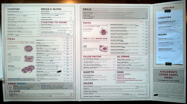
Menus with too many items can be confusing for diners. Photo Credit: Ben Babcock
Gone are the days when menus were novels, when guests had to wade through pages on pages of items just to make it through the appetizer list. Keeping your menu short equates to keeping it manageable, and today more restaurants are opting for less items and higher quality. You may argue that your chefs have too many great ideas to not put them on the menu, but the counterargument is that customers would truly rather choose from a handful of incredible menu items than a hundred mediocre dishes. Another assertion is that a smaller menu allows your operation to change things up from time to time, to utilize fresh, in-season ingredients, or to add or subtract menu items as desired. The old saying, “quality over quantity” rings true where serving hungry customers is concerned.
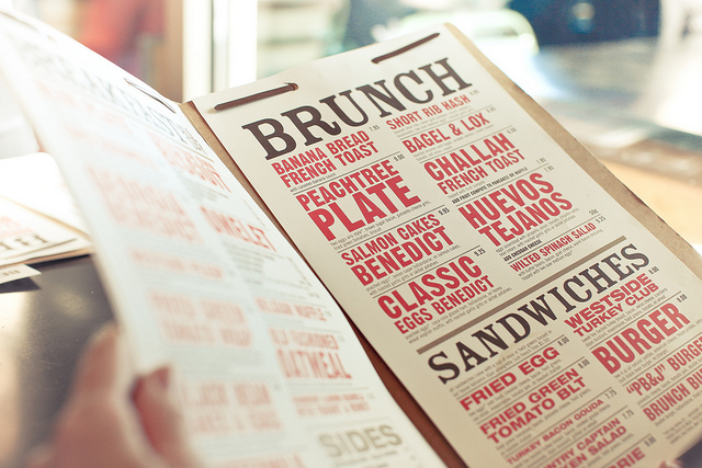
Color scheme points to the restaurant’s personality. Photo credit: Basheer Tome
Color scheme speaks to the character and personality of your restaurant. Choose color, fonts, and backgrounds carefully, with the message you wish to convey to your customers always in your mind. White space helps the layout of nearly every menu design—open space on the page offers a better visual appearance to your guests. Pictures aren’t for every restaurant, but there are times that photos really do communicate a message to consumers, highlighting healthier ingredients or desserts, for example. It can’t be stressed enough, though, that pictures are most effective if used sparingly, and quality does count. If you can spare the expense to hire a professional food photographer, it is highly recommended.
Your menu should offer a variety of prices, allowing your guests to have the option of spending more or less when dining in your restaurant. An assortment of menu options will allow this to happen naturally, as ingredients are purchased at differing prices. Chicken, for example, is less expensive than beef, and vegetarian items nearly always cost less than both. A couple of different options from each of these categories should give your guests choices. Psychology suggests that using dollar signs make diners more apt to search for less expensive items; therefore, they are best left off of your menu. Also, lining up prices to the right of the menu item prompts your guests to price-shop. A better design option is to stagger the prices by placing the cost of the dish three spaces from the last letter of the menu item, without using dots or other fillers. While it is true that most customers are price aware, don’t be afraid to adjust your prices according to market value of the dish you are serving. Customers do expect some variation in pricing and won’t generally squawk if the increase isn’t a large one.
Lastly, and perhaps most importantly, make sure you proofread your menu before printing, and get feedback about your menu offerings and its design. Don’t be afraid to ask outside of your business for advice or suggestions, and if you are uncertain whether your menu will make the right impression on your diners, don’t be afraid to hire someone to help you out. It’s a worthy investment you won’t regret.
How is your menu looking? Is it time for a design overhaul? Will you pare down your menu or adjust your prices?
Feature Image Photo Credit: Sam Howzit


